

Brief
Find a range of illustrators who use a particular medium. You may focus on the traditional such as pencil, watercolour, paint, gouache, coloured pencils, oil or acrylic paint, coloured pencils, collage, prints or on the more obviously digital processes – including digital collage, photography, digital drawing and painting.
Catalogue the illustrators according to similarities in the way that they use tools and materials. How do they distort or exaggerate the representation of elements in their work? How do they communicate through use of metaphor or symbols?
Choose one image which you most appreciate visually. In your learning log write about the way that the illustrator works. It often helps to begin by describing a picture. Ask yourself questions as you write such as: How is the image composed? How are colour, tone, and texture used to evoke mood or convey an idea? Has the illustrator distorted the content within the imagery and how does this work for the purpose the image fulfils?
Go back to a visual you created for an earlier exercise and now render it using the same tools and materials as your chosen artist.
Now choose a very different artwork and repeat the process.
Charcoal
I have decided to look at illustrators who use charcoal as this is a medium I haven’t really experimented with.
Catalogue One: Expressive
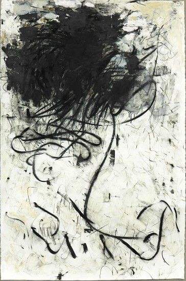
These illustrators use charcoal in a very similar way. Their style is loose, dynamic and expressive. All three use lines outside of the subject to suggest movement and form. These illustrators are unconcerned with depicting absolute realism, it is more about conveying a mood and bringing life to the subject.


April Coppini ‘Shorthaired Bumble Bee’ and ‘Black-tailed Jack Rabbit’.
April Coppini. Available at: http://aprilcoppini.com/2016 Accessed on: 19th July 2018


Guy Denning ‘And The Day Starts’ and ‘Paradis Est Ici’.
Guy Denning. Available at: https://guydenning.org/portfolio/drawn/#jp-carousel-271 Accessed on: 19th July 2018


Valerie Davide ‘Guiness’ and ‘Bo’.
Valerie Davide. Available at: https://www.davidsonfineart.com/artists/davide.htm Accessed on: 19th July 2018
Catalogue Two: Controlled
These illustrators use charcoal in a much more controlled and exact way. The charcoal is meticulously blended to create a soft, smooth finish and there are no harsh lines or expressive marks. This style is much more realistic and closely resembles digital cartoon graphics.


Aron Wiesenfeld ‘David’ and ‘Drainpipe’.
Aron Wiesnfeld. Available at: http://www.escapeintolife.com/painting/aron-wiesenfeld/ Accessed on: 19th July 2018


Simon Varela Scene’s from Pixar’s ‘Finding Nemo’ and ‘The Croods’.
Simon Varela. Available at: http://kidlitartists.blogspot.com/2015/01/inspiration-simon-varela.html Accessed on: 19th July 2018
Catalogue Three: Abstract/Semi-Abstract
These illustrators use abstract line and shape to suggest form and movement. Tobie’s ‘Good Witch’ series is a semi-abstract group of work that represents fashion models on the runway. He has used lines of different weights to depict the curves of the models and the movement of the clothing.
Krista Harris ‘Whipper Snapper’.
Krista Harris. Available at: https://www.telluridegallery.com/artist/Krista_Harris/works/3792 Accessed on: 19th July 2018


Tobie Giddio Rodarte ‘Good Witch’ commissioned by SHOWstudio as part of the New York womenswear coverage.
Tobie Giddio Rodarte. Available at: http://www.tobiegiddio.com/portfolio/showstudio-ny-ss14-fashion-week/ Accessed on: 19th July 2018
Chosen Image | ‘Black-tailed Jack Rabbit’
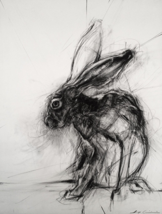 I really like this image by April Coppini. The illustrator has worked with fast, loose, expressive strokes and it looks like she has built up the image in layers. Some of the construction lines look quite light as though she started building up the shape in pencil before going in with charcoal to define the shape. Composition-wise April has placed the illustration in the lower right quarter of the canvas. The positioning works really because although the hare is off-centre, the composition looks really balanced. The illustrator has been sparing with tone leaving most of the illustration as a line drawing with the canvas showing through and she has opted for greyscale. This gives the illustration a moody, edgy aesthetic as opposed to the twee traditional style that you often see with woodland animals, i.e. Beatrix Potter. There is a lot of energy and movement in the illustration because of the lines going in different directions; you can almost imagine the hare taking off at any second. This energy suits the subject as hares are famous for their speed and being constantly on high alert for danger. There is no actual distortion in the image; April has empathised the hare’s long limbs and ears but she hasn’t over-exaggerated them. I would describe the work as ‘expressive’ as the illustrator has used lines and marks around the illustration to suggest movement.
Image One
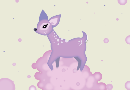
This is an early piece of work I did for the exercise ‘History of Illustration’ and it is inspired by digital artist Alexandra Zutto. I used Adobe Illustrator to create the image, which I built up using the shape tool. I used soft, candy colours and kept the shapes rounded and curved. I kept the texture very smooth and blended and used gradients to suggest form. I exaggerated certain features to give the deer an otherworldly and cartoonish cuteness. I think that this is a good choice for this exercise because Zutto and Coppini’s styles are so very different.
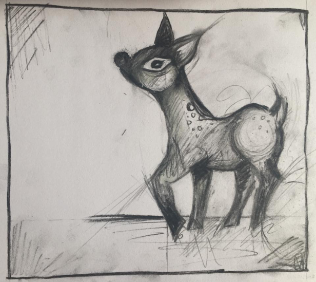
Definitely not a patch on Coppini’s illustrations but it was a fun technique to try. I used lots of loose lines to try to suggest movement and to build up the shape. I found this one quite difficult because the original image is quite cartoonish. I think the end result looks like a really badly observed drawing of an actual deer rather than a cartoon deer rendered in charcoal, if that makes sense! I think that certain styles are suited to particular materials and techniques.
Image Two
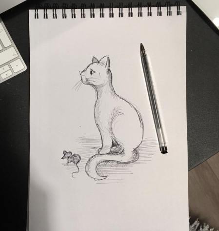
For the second image to re-render I chose an ink sketch of a cat I drew in the style of E.H Shephard.
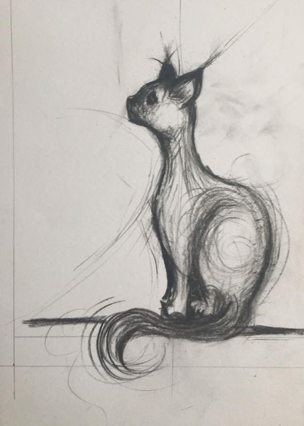
This drawing looks better as the original drawing was in a semi-realistic style. I tried to use line to suggest fur, particularly the fluffy tail. I also wanted to emphasise the cat’s position and alertness as if he has seen food and is waiting expectantly. His neck is stretched and body poised to move.
Reflection
I really enjoyed working in charcoal and in using a freer, looser and more expressionistic drawing style. It was really fun to do and it’s a great technique to use to capture something in motion.
